Diary #12 - New Progression & UI

As per usual, I underestimated the amount of effort involved in putting together a new user interface. So why did I go through the effort of redoing some of the UI? Game progression.
So far in the prototype, trains have basically been random. Apart from the first train that grants you pops, gold, and wood, all of the trains have randomly generated cars. This was basically just filler behaviour, so that the game was actually playable. In order to convey what was in each car, I put together a simple panel for each car. That part was intended to be the long term design, but it didn’t quite sit well with me. Part of the issue was that it was hard to tell exactly what each panel was actually telling you - the small graphical space and lack of text made things unclear.
I didn’t immediately have any solutions though, so I moved on to the next big piece - adding an actual feeling of progression to the game. Eventually (with the help of my partner) ended up with the concept of picking from a set of pre-assembled trains, assigned to a specific “progression level”, rather than assembling random trains. This way the trains can have their own character (different colors, logos, etc.), have cargo that fits the stage of the game, and be open for trades that the player is more likely to actually use.
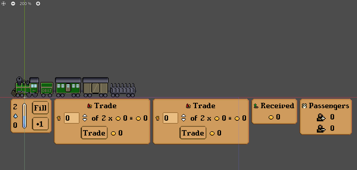
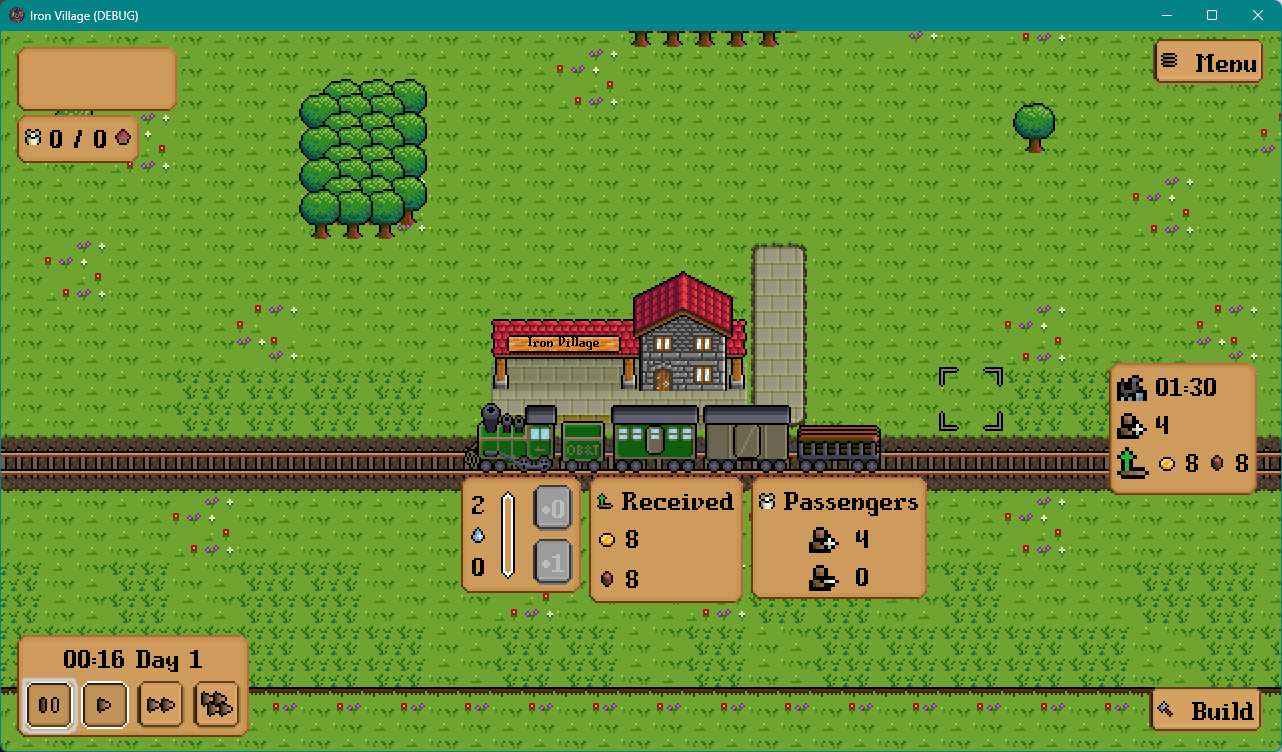
This looped back around to the train UI - if the trains are treated as one thing, rather than a collection of separate cars, then the UI should reflect that. Instead of a bunch of tiny panels for each car, with their own varying transaction types (sale, purchase, etc.), there would be panels for each transaction type across the whole train. Sales of resources to the player would all be on the same panel, gifted resources on another, and passenger info on another. This also allows for a new “fuel” panel - steam engines need to get the water tanks topped off, and later on in the game the trains will be expecting coal to be restocked. These are the only cases where you’ll be expected to supply a resource without any payment, so it makes sense to have a dedicated panel for them.
Anyway, the UI is still in progress, but there’s enough that I’ve actually done a lot of the progression framework as well. It’s nice to finally be adding some length to the game and see the mechanics I built over the last few months actually come to life!

Get Iron Village Beta Demo
Iron Village Beta Demo
With your railway, build houses, farms, and more to create your village. Trade your goods and grow it into a powerhouse.
| Status | In development |
| Author | Chappington |
| Genre | Simulation |
| Tags | City Builder, Pixel Art, Trains |
| Languages | English, Spanish; Latin America, Portuguese (Brazil) |
More posts
- Diary #38 – A Peak at Late Game23 days ago
- Diary #37 – 0.7.31 Release Notes34 days ago
- Diary #36 – 0.7.26 Release Notes45 days ago
- Diary #35 – BostonFIG After Action Report71 days ago
- Diary #34 – 0.7.15 Release Notes78 days ago
- Diary #33 – BostonFIG & Gameplay Overhaul78 days ago
- Diary #32 – 0.7.00 Release NotesNov 23, 2024
- Diary #31 - Progression Level 3Nov 16, 2024
- Diary #30 - 0.6.33 Release NotesNov 08, 2024
- Diary #29 - Demo Mk. IIINov 03, 2024

Leave a comment
Log in with itch.io to leave a comment.